User experience (UX) research is fundamental for brands to understand how their consumers are interacting with their products and services.
At quantilope, UX is at the core of our SaaS platform, making market research more efficient and transparent for our users. Being a topic of close interest, we ran an internal, exploratory study among 900 US consumers (18-55, who own a smartphone and are users of a music streaming service) to understand whether traditional quantitative market research methods can be used to enrich qualitative insights. More specifically, we chose Spotify* as an example of a music streaming platform that is known to update their user interface (UI) quite frequently, and has gone through multiple iterations of their mobile app over the years, to see if they’ve moved to a more optimal UI over time.
*Please note: This is an independent study conducted by quantilope. quantilope is not affiliated with Spotify. All visual stimuli used in this study belongs to Spotify.
The Survey Set-Up
For this study, we used a Choice-Based Conjoint (CBC) Analysis. A CBC asks participants to make trade-off decisions between different products in a competitive environment, to find out how purchase likelihood is influenced by variations in different product attributes.
In this study, we applied a CBC to test six versions of Spotify’s mobile app “Library” page, each divided into four segments (the product attributes analyzed within the CBC):
- Top Navigation Bar (“Your Music”, “Your Library”, “Music + Podcasts”)
- Music Content Segment (Playlists, Artists, Albums)
- Music Tab (Song title, play, pause)
- Main Navigation Bar (Home, Search, Library)
Below is more detailed look at these four segments, and how they appeared as participants viewed the visual stimuli in the CBC exercise within the survey:
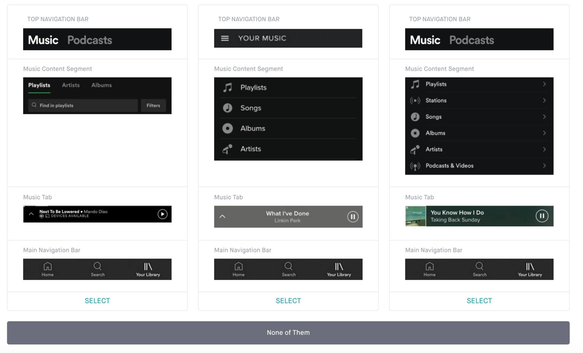
Respondents were shown a series of Library pages (like each of the three pages above) with different combinations of the four segments, and were asked to select which page was most appealing in terms of design, features, and functionality.
The Conjoint In Action
The CBC comes into play by creating multiple scenarios/combinations of the segments and continually asking respondents to make trade-off decisions to select the option they consider most appealing. By generating these multiple scenarios and testing visual appeal, certain segments rose to the top as consistently preferred, regardless of the other segments they were paired with.
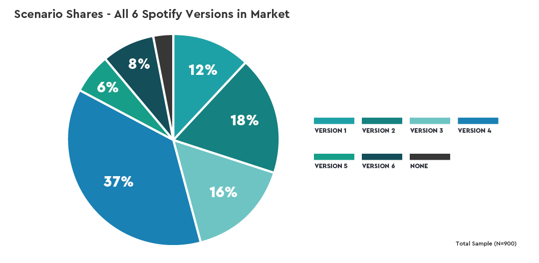
Notably, although Spotify has made advancements to their mobile app design in recent years, consumers don’t consider these changes more appealing for their user experience on the app. Of the 6 versions we tested, ranging from the oldest Spotify layout to the current version (and even a hypothetical improved current version) it’s one of the interim versions that stood out as the most appealing (Version 4, as shown in the image below).
Product Improvements:
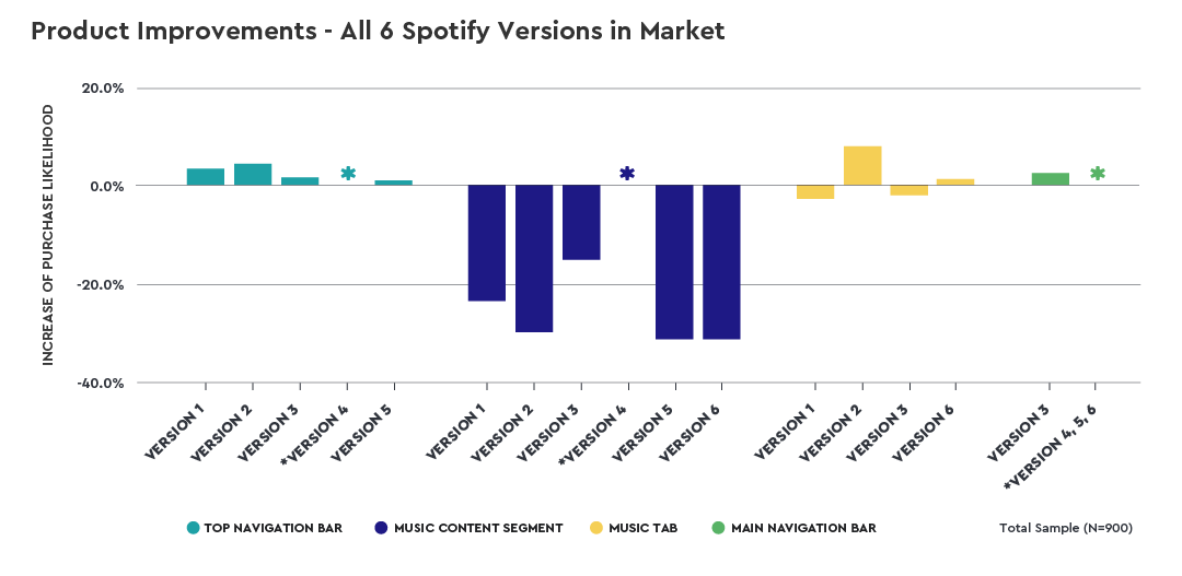
Version 4 was identified as the most appealing, but even so, could be improved further. The product improvements chart (below) shows that Version 4 can be further optimized (aka, increased purchase likelihood) by adding in the the top navigation bar from version 2, the music tab from version 2, and the main navigation bar from version 3. Adding the music tab from version 2 will increase purchase likelihood by 9%. Changing the top and main navigation bars will increase purchase likelihood by 5% and 3% respectively.
Identifying the Optimal Version:
Aside from testing the six versions as collective pages, we also used the CBC to identify the most appealing version of each of the four segments individually.
Music content segments in versions 1, 3, and 4 that had a vertical layout outperformed versions 2, 5, and 6 which had horizontal layouts. In addition, the music tab in version 2, which was more colorful and had bigger font sizes, performed better than the music tabs in versions 1, 3, and 6, which were either black or gray and had smaller font sizes.
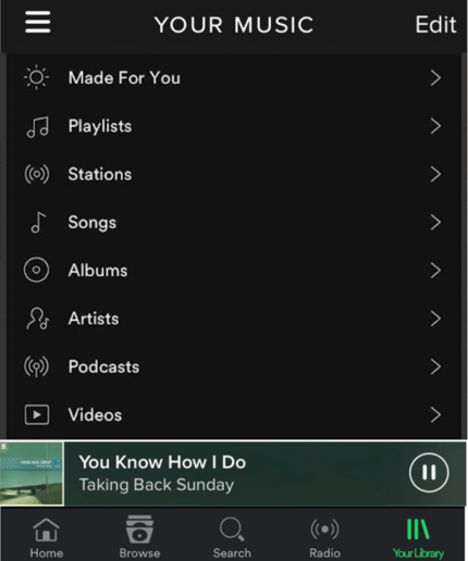
Our software combined these best-performing segments and identified the optimal version, which we then tested to see how well it would perform against the original six versions through a simulated market scenario. We found that the optimal version outperformed all other versions and this was true among both older and younger audiences, suggesting a universal appeal. Below is how the ‘optimal’ version would appear, combining the top performing versions from each of the four segments:
Applications Beyond the Study:
Using our CBC results, we came up with three hypotheses that (in this example) could be further tested by Spotify’s qualitative research team:
- Hypothesis 1: A vertical layout for the music content segment is easier to read and process.
- Hypothesis 2: Black/grey elements of a page are perceived as being more dull/plain than colorful elements, leading to higher preferences for colorful elements.
- Hypothesis 3: The high purchase likelihood of the optimal version is due to its more universally appealing design by all age groups.
This study is an example of how quantitative methods can be applied in unconventional ways to guide and focus future qualitative research. Using both quantitative and qualitative methods in tandem allows a brand to gain a more holistic understanding of their users' experiences with a product or service.
Exciting Real-World Developments:
Further validating our findings, Spotify recently launched (after our research had concluded) a new Library page that shows their UI is starting to revert back to some of the older layouts, particularly for the top navigation bar and the music content segment. This is proof that leveraging both qual and quant methodologies to support design research prior to launching new interfaces (or, any new product/innovation) can save valuable resources for a brand while optimizing on behalf of consumers.
For more details on which mobile app segment consumers consider most important, which segments led to the optimal design layout, and what the market would look like if Spotify introduced that optimally identified version, check out the full dashboard below:

