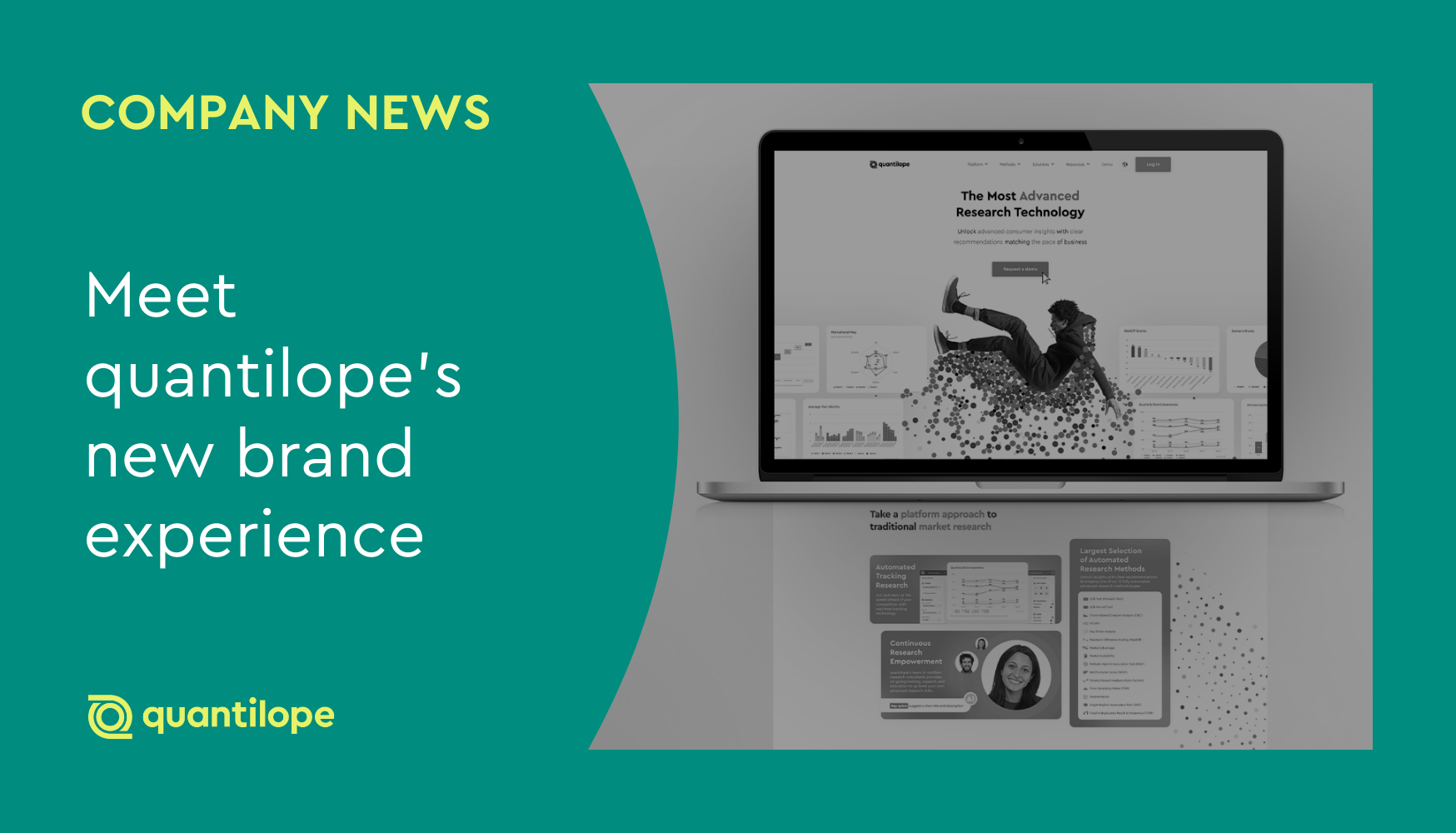
If you’ve visited quantilope’s website recently, you may have noticed a brighter, fresher look and feel.
The revamped website welcomes visitors with engaging product imagery, a bolder color scheme paired with dynamic black and white imagery, and eye-catching dots, representing the abundance of data points processed through quantilope - guiding the reader’s eye down each page.
This transformation reinforces the space quantilope owns within market research - solidifying our position as the most advanced research technology in the ever-expanding research space.
A picture’s worth a thousand words
In building quantilope's new brand experience, we sought visuals and a graphic language that would both showcase our innovative technology and convey our mission to free all marketing decisions from gut feel.
We achieved this through a dynamic interplay of our signature green hues and energetic movement, symbolizing the ever-shifting consumer landscape and the need for brands to continuously gather high-quality, actionable insights. The seamless flow and interconnectedness of the design elements also evoke the automation that lies at the heart of our platform, streamlining processes and amplifying efficiency.
Our new homepage header features a figure falling into a bed of data points cascading around him and various charts, reminding visitors of the insights derived from advanced and tracking research – quantilope's specialty – that empower executives to drive brand growth. Through automation, we make these powerful tools accessible to all, democratizing data-driven decision-making.
But a picture is worth a thousand words, so instead of telling you, let us show you.
The picture
Showcasing our innovation
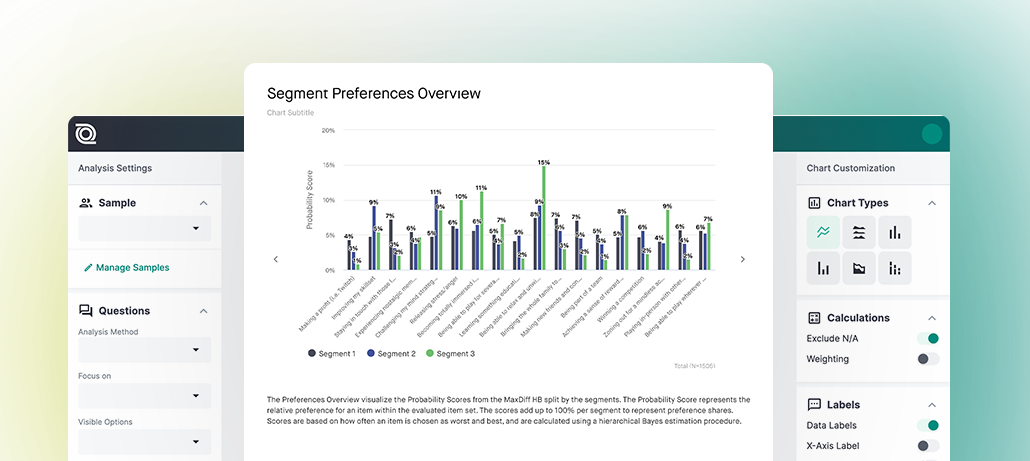
A major highlight of the rebrand is showcasing the innovative nature of quantilope's research technology. quantilope offers the largest selection of fully automated advanced research methodologies (CI Advanced) and automated tracking technology (CI Tracking) on a fully connected end-to-end research platform. It was crucial that our rebrand offer visitors a glimpse into the quantilope researcher experience.
Within the new design, you'll see frequent platform imagery and representations of the entire advanced method and tracking processes, from start to finish. The rebrand is a visual testament to quantilope's commitment to innovation, automation, and user-centric research solutions.
A vibrant new color scheme
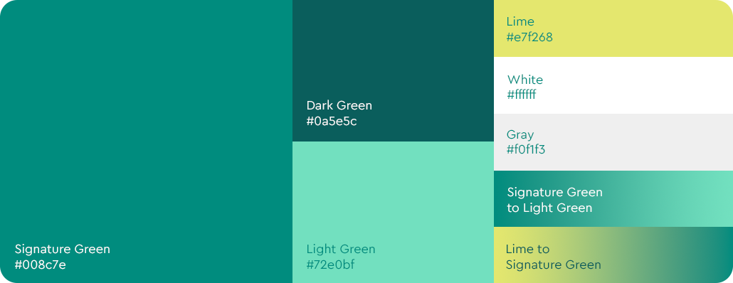
The first thing visitors will likely notice about quantilope's revamped website is its vibrant new color scheme: a carefully curated selection of bold greens, gradients, black, and white. The fresh palette expands upon quantilope's signature green, adding energetic tints and shades, including a lime hue that represents the "light bulb moment" of insight. This lime signifies the answers uncovered through research, while the signature green symbolizes the questions that initiate the process. The interplay of black, white, and gray provides a fresh, modern backdrop for these vibrant greens, ensuring a visually striking and sophisticated aesthetic.
A dynamic touch of black and white

A dynamic touch of black and white imagery elevates the rebrand, adding sophistication and cohesiveness to the website. This monochrome element serves as a visual anchor, providing balance to the vibrancy of the new color palette without overshadowing quantilope's core messaging and platform functionality. The juxtaposition of black and white with splashes of reduced vibrancy symbolizes quantilope's ability to inject energy and clarity into the world of research, bringing movement and color to the insights landscape.
A sense of movement

The new website comes to life through intentionally scattered dots that flow seamlessly from module to module and image to image. These dots, echoing the center of quantilope’s logo and symbolizing data points in motion, evoke the interconnectedness of consumers and insights, guiding the viewer's eye through the website and platform.
This dynamic visual language reinforces quantilope's core identity as a data-driven company, constantly analyzing and transforming information into actionable insights. The dots' fluid movement also mirrors the ever-evolving nature of consumer behavior and the continuous flow of data within quantilope's platform.
Looking ahead
After months of cross-team collaboration, brainstorming, and planning, quantilope embodied the platform's tech-forward, innovative approach into a fresh and new website design. With these visual updates, quantilope remains true to its core focus on automated, advanced research.
We’re excited to share the new quantilope brand with all our current and future customers, as a symbol of quantilope’s commitment to grow, expand, and reinvent in order to best serve our clients. To learn more about quantilope and how you can get started on the platform, get in touch below!